Landing page ecosystem strategy
Top of funnel pages (ie: SEO landing pages) hadn’t had user experience love in years, if ever. For over a year and a half, a colleague and I built the landing pages ecosystem from the ground up starting with migrations to a new platform and then optimization and iteration of the pages in many different ways.
Our primary focus was landing pages servicing the hotels and vacation rental lines of business.

The problem
The city/multi-city version of the hotel travel guide (HTG) was one of the first pages that we tackled upon joining Expedia. This page services organic search queries such as “Seattle hotels” or “Dallas Fort-worth hotels”, giving customers a focused place to land that ideally gives them content to help them find a place to stay in the destination they desire.
There were quite a few problems we needed to tackle:
This page was run by the SEO team who, at the time, was not customer centric at all
These pages hadn’t had any user experience or content strategy love in at least 6 years, so it was in desperate need of strategic thinking
The pages are built on a CMS-like platform which enables internal stakeholders to edit and move page content around without the help or oversight of engineering or UX
The page story was all over the place and didn’t give customers the information they needed to help make a decision
The team was about to start migrating to the PWA platform, which utilized a completely different UI library
Within the rest of the landing pages ecosystem, there was a lot of duplicative content
The process
What do we know?
Unfortunately, because this team was very new, we didn’t have any UX research help, so we took to the research archives and the internet to see if we could find any relevant research to help us understand customers better. We discovered a few key pieces of data that helped us form a customer profile to center around.
Based on 2018 qualitative data from existing landing pages we saw:
Overall, conversion decreased by ~12%, click through rates decrease by ~4%, and bounce rate increase by ~7% year-over-year but we did see higher interaction and CVR on desktop than on mobile
Search windows differ between channels, with customers coming in through SEO searching on desktop devices 15-30 days out from their intended travel date and more last-minute searches happening on mobile devices
According to a 2016 study from Google:
94% of leisure travelers switch between devices as they plan or book a trip
69% of travelers worry that they aren’t finding the best price or making the right decision
2/3 of leisure travelers double-check prices on a desktop after shopping on a smartphone
88% of travelers with smartphones would switch to another site if they can’t find what they’re looking for
75% of leisure travelers who shop for hotels on their smartphone typically end up purchasing on a desktop or laptop computer
Who is our target customer?
Based on the research above, we outlined a few high level travel profiles to focus on. Overall, we knew there was a huge opportunity to improve the experience for leisure travelers shopping within 30-0 days within their intended trip on their mobile phones. This profile was strengthened by recent updates from Google, which prioritized mobile experiences over desktop when the SEO bots were scarping sites.
Within this profile, we noted 3 types of travelers that we needed to think about:

Planner
“I want to go somewhere in a month”
Profile:
Leisure traveler
15-30 day search window
Uses mobile and desktop platforms

Globe-trotter
“I want to be spontaneous and go on a trip today! Maybe there’s a deal I can take advantage of!”
Profile:
Leisure traveler
0 day search window
Primarily uses mobile

Trouble shooter
”A snowstorm hit the city and I am stuck here for another day.”
Profile:
Any traveler type
0 day search window
Primarily uses mobile
We also looked at the traveler journey to understand what trip-planning phases a customer might be in, noting specific pain points in the current journey and any questions they might need to answer in order to feel confident that a particular destination and/or property meets their needs.


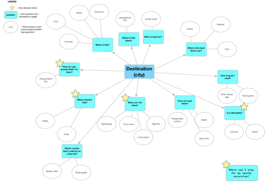
After all of this analysis, we determined that City / Multi-city hotel travel guides needed to stay high level, providing entry points to help answer property-related questions, while primarily providing information to help the customer answer the following questions:
Where should I stay?
Is the lodging affordable?
How do I get around while I’m there?
What can I do / visit / eat / drink that is around the hotel I’m looking at?
Where can I stay for a nearby excursion?
Reducing duplication
In looking at the rest of the landing pages ecosystem, one of the big problems we saw almost immediately was there was a lot of duplicative content. We mapped content types between 2 pages that were especially similar and then defined each page to ensure a more focused job of page. We built upon this work in future landing page strategy efforts to create a holistic view of the job of each page within the ecosystem.
Travel discovery landing page
The Travel Discovery pages help travelers explore and plan destinations and experiences for their next trip. Their job is to be relevant and engaging for travelers who aren't yet ready to shop for travel products, and to help the traveler build a foundation for easy shopping later.
A traveler can not get to a DX page very easily at the moment.
City / Multi-city hotel travel guide
City / Multi-City Hotels Landing pages help travelers compare available lodging options in a destination to understand if the destination meets their budgetary and travel needs so they can narrow down their search.
A traveler can get to a C/MC page from a DX page or an organic search.
Forming a hypothesis
After all of this research & analysis, we were able to formulate a hypothesis and content themes to center around going forward:
Hypothesis: By enabling customers to find the best hotel that meet their budget and travel needs, customers will more likely be confident to book with Expedia after completing their research.
How might a we:
Surface content relevant to travelers situation?
Help a customer determine how much would this destination cost?
Inspire travelers to choose one hotel over another?
Answer travelers questions about certain hotels in a destination?
Competitive analysis
We wondered how our main competitors were solving these themes and if there were gaps we could fill that our competitors weren’t. We started with a content analysis, breaking the pages down and identifying if it was available (green), available but not discoverable (yellow), or not available (pink). This color coding allowed us to quickly identify table stakes and gaps that we could take advantage of.
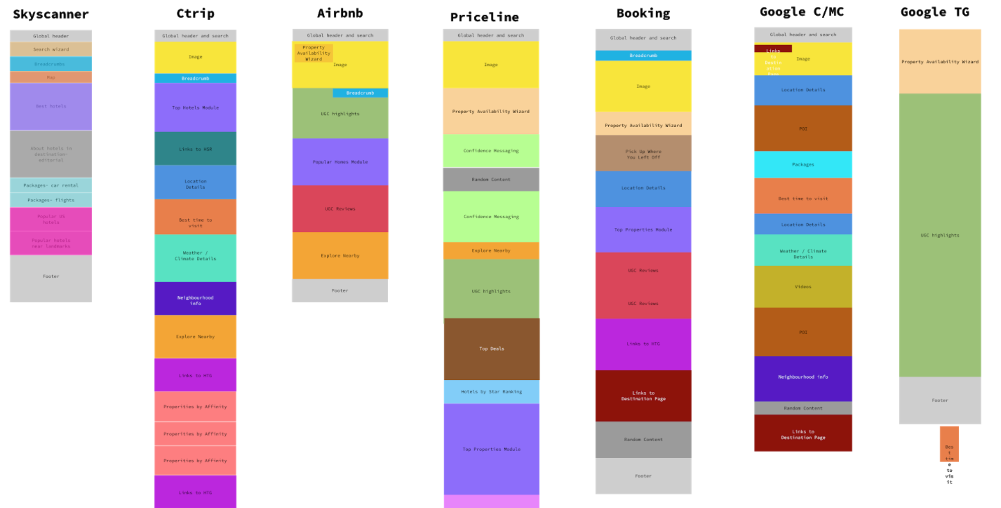
We also mapped the content hierarchy on our current state pages and how that compared to competitors.

Table stakes & opportunities
Overall, our competitors were doing a lot of things well that we consider to be table stakes based on the destination and property questions identified earlier in our research.
Improved content hierarchy
By creating content hyper-focused on hotel options for a specific destination and by grouping related content, travelers are able to make decisions about which hotel meets their needs quicker
Asking questions in editorial subheadings
Chunking out content into frequently asked questions helps travelers scan the page, finding their answers quicker. Questions in the editorial also help the page index higher, improving SEO rankingsSimplified mobile content
Simplified content allows mobile users to get to the information they’re looking for quicker. While Google is seeing a growing trend in bookings on mobile, in general, we’ve seen users starting their search on mobile and moving to desktop to bookAmenities Information
Providing amenities information, however granular, helps travelers understand which hotels fit their needs as well as any cultural differences that affect all hotels in a particular locationFiltering
In addition to top or most popular hotels, several competitors also listed hotels by affinity on these pages, giving more insight into the types of traveler needs the destination accommodates
There were also a lot of really great opportunities identified to take our pages above and beyond the status quo.
True hotel comparison
The ability for customers to compare features of a property or destination without having to open multiple tabsPrice trends
Showing high level price trends over time, so customers could see peak and off seasons for a destinationLeisure trip type indicators: family friendly, couples, etc
Identifying properties that met important trip criteria that our customers could be looking forDynamic modules based on channel, POS, and/or device type
Customizing content to be more locally relevant or simplify content based on device type
We also noticed that none of our competitors did a good job of answering the following key questions that customers use to determine if a destination is a good fit:
What can I do / visit / eat / drink there [that’s around the hotels I’m looking at]?
Where can I stay for my nearby excursion?
How do I get around while I’m there?
Illustrating concepts
The team was ecstatic to learn how many opportunities we had to improve our pages and really stand out. Since a lot of us are visual, we decided to illustrate 2 concepts that illustrate what the pages could look like if we were able to meet table stakes and opportunities that we identified.
Prototype 1: Hotel search results inspired city/multi-city page
This concept took inspiration from the Hotel Search Results UI to give travelers a familiar experience while incorporating additional destination lodging information, in order to allow customers the ability to compare hotels unique to their situation and to increase continuity to the dated experience.
Prototype 2: Module-based city/multi-city page
The Module-based layout utilized a more conventional structure but addresses the needs of all three of our users based upon the discovery of the content. Users are confronted with general pricing trends, unique hotel types based on the destination, in addition to a deal based on today’s date. Furthermore, instead of pre-determined affinity and amenity based hotel card carousels, we’ve created a module where users can select top filters to surface hotel cards based upon their choices.
Enhanced map experience
We also saw a big opportunity to present content in a more visual way, so we also prototypes an enhanced, interactive map which would allow travelers to visually compare hotels in different neighborhoods so they can find a hotel that meet their budget and travel needs. We proposed to not only show hotel information on the map, but layer other content that would help answer some of the travelers’ questions:
- Where should I stay?
- Is the lodging affordable?
- How do I get around while I’m there?
- What can I do / visit / eat / drink that’s around the hotels I’m looking at?
The outcomes
We were able to improve and simplify the content hierarchy almost immediately by way of page migration. The other improvements were ultimately paused due to changes in product partners and the need to migrate more pages to the PWA platform prior to optimization, but this strategy provided a vision for landing pages that we’ve been testing toward since. A lot of the solutions illustrated in this original strategy are still love today!
FAQ
We saw some interesting results with the addition of FAQ content. While we achieved higher Google SERP rankings, this test was ultimately moved lower on the page to discourage discovery, but still take advantage of the SEO benefits. lack of quality content and clear next steps within the module.
Eventually, we added links to the hotels we featured in the module which helped customers discover properties both from the SERP and hotel travel guide.
With this learning gained, we also experimented with adding FAQs to property detail pages and found continued success with the changes we made above. This experiment was rolled out after seeing a $1.32M increase in GP and an increase in conversion by 1.17%
Price trends
My colleague took on the interest task of tackling the price trend graph, which was tested in Q2 of 2019 and deemed a success with a $57.5k GP uplift:
Conversion increased 0.66%
Click through rate increased 0.12%
Bounce rate decreased 0.03%
It was a rocky road to get here, however, due to unstable services that didn’t have a team supporting it.
We optimized the graph in a second version, by automatically opening a popover with the current month’s pricing data after finding that customers weren’t certain that the graph was interactive. Interestingly, this test was rolled back after seeing a GP decrease of $121k and finding:
Conversion decreased 0.78%
Click through rate decreased 0.02%
Bounce rate decreased 0.05%
After these couple of tests, the experiment was put on hold while we were waiting to see the outcome of the services, and hypothesize that a different graph and stronger signifiers of interaction could increase understanding.

Enhanced map experiences
Restaurant & landmark pins
Since this vision was created, we’ve been able to conduct multiple tests to enhance the map experience on HTG. In a simple addition to the map across a few different pages, we were able to display restaurants nearby a properties to finally start to answer the question “What is there to do / eat / drink around this property?” This test goes to show that keeping it simple pays off.

On-page dynamic map
One of the larger page enhancements that we’ve tried testing was an on-page dynamic map. While we did see GP uplift of $350k, ultimately this was rolled back in leu of more investment to polish this concept. There were quite a few learnings, however, that we will consider in future iterations:
In this version, due to technical limitations, the content on the page wasn’t able to talk to each other, so there was a very clear disconnect between what we showed in the map vs the rest of the page.
There were some significant interaction challenges we ran into when translating existing map functionality from a full-screen dialog to on-page - things like page scroll and bottom sheet position would need to be explored to make this experience feel polished.