SAP Concur design system
I was the lead designer working to define and document commonly used patterns and components to ensure a consistent, accessible experience across all SAP Concur products and services.
One such component, Card, is a great example of how worked from concept to through documentation.

The problem
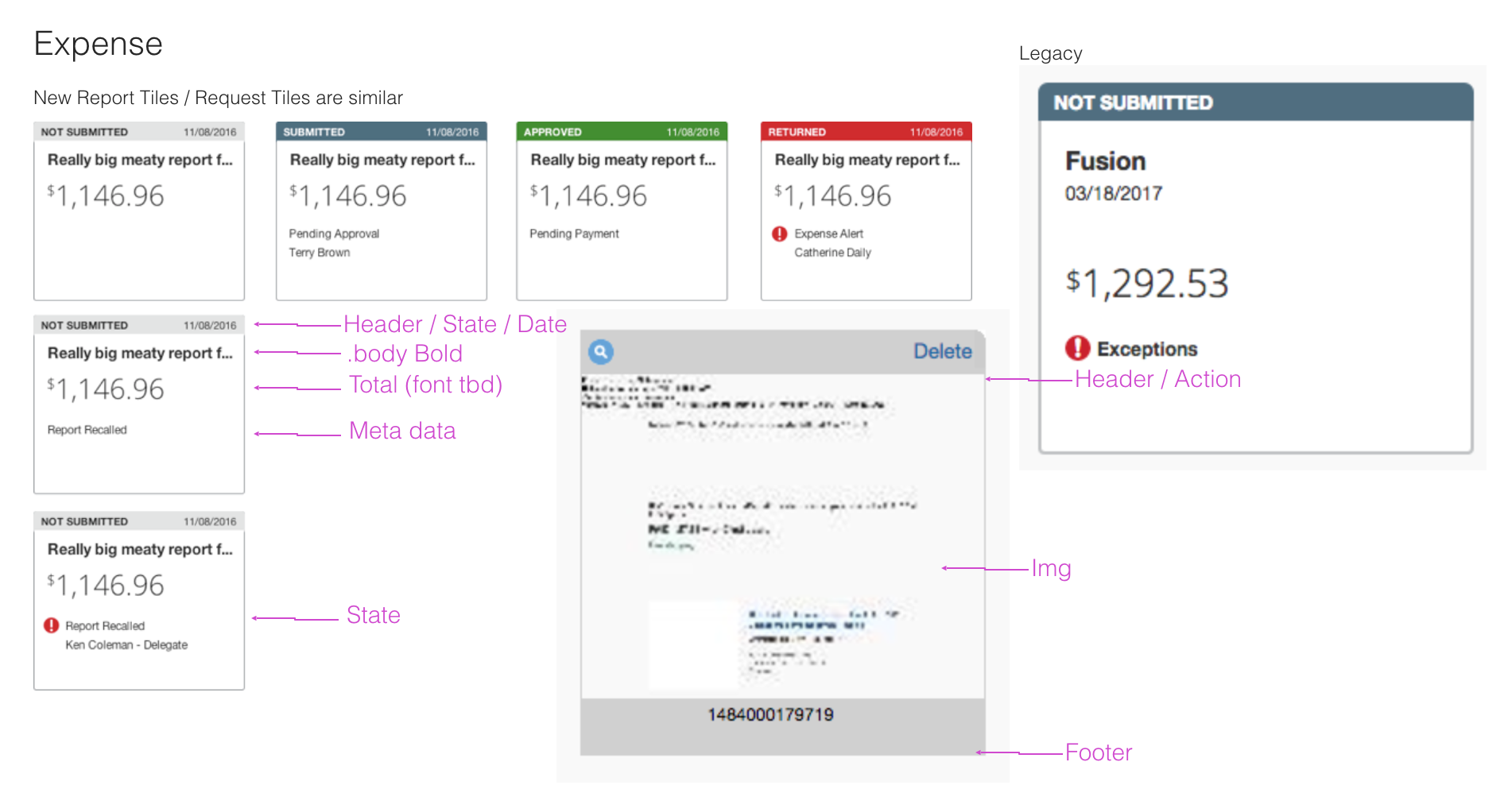
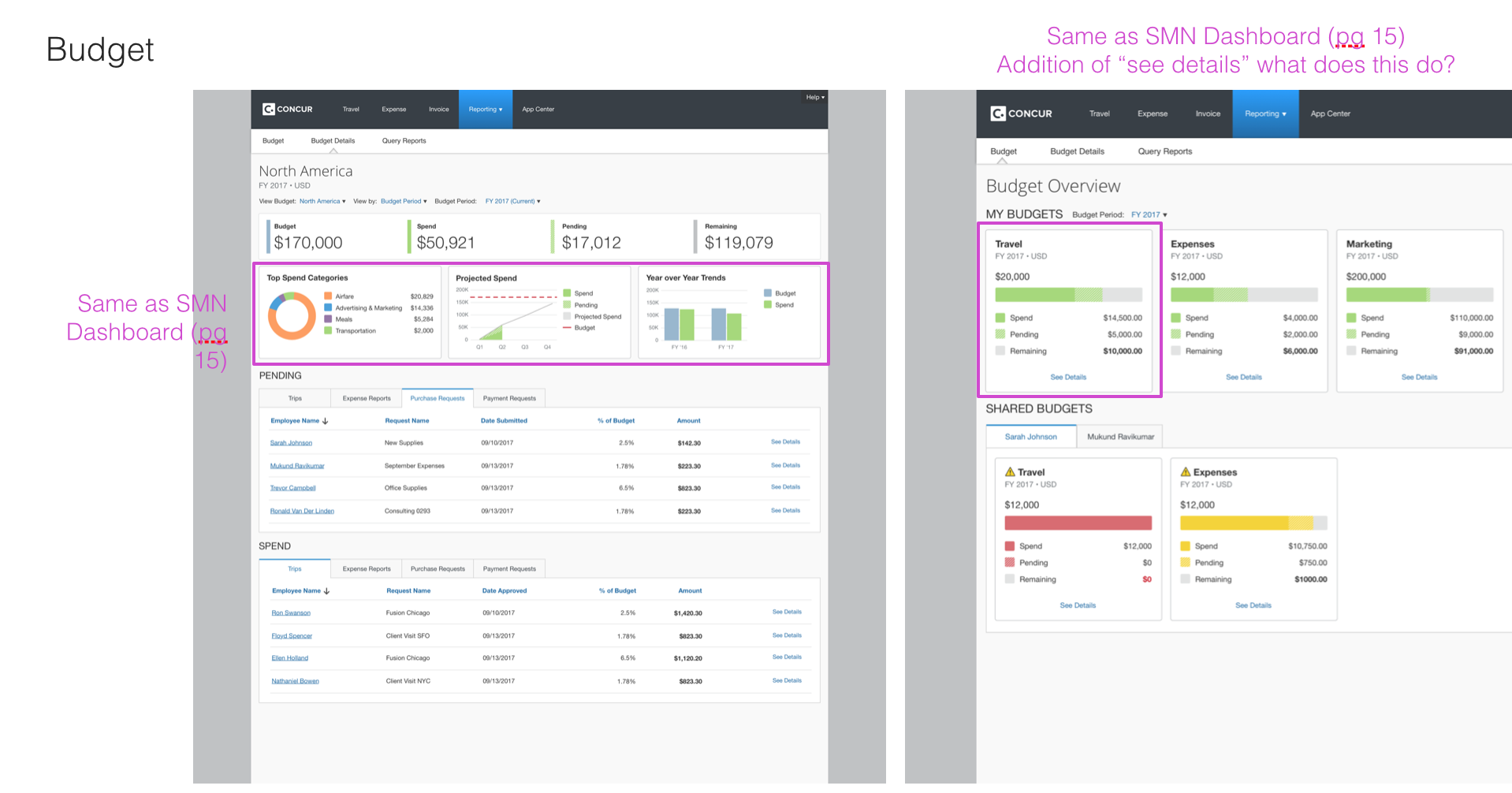
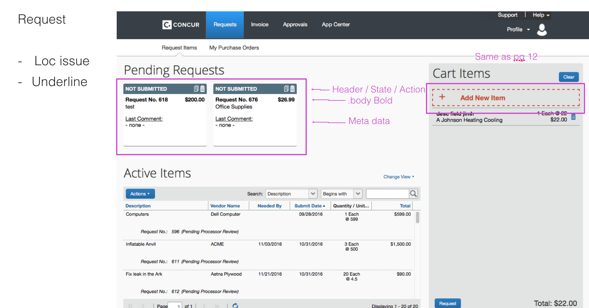
Cards (previously called Tiles) were the primary navigation mechanism within a majority of Concur products. With new functionality being designed and developed every day, the UI became a jumble of container types, typography styles and sizes, and ways to convey status. Additionally, there were variations of the card that either caused alarm by utilizing a color too similar to the red used for alerts, or hid important functionality without signifying to the user that it was available, making it difficult to know the actions could be taken.
The goal of this project was to define and outline the card variations for designers and developers to use going forward, ensuring consistency across all products, a clear hierarchy of information, and signal to the user if actions could be taken.
Research & definition
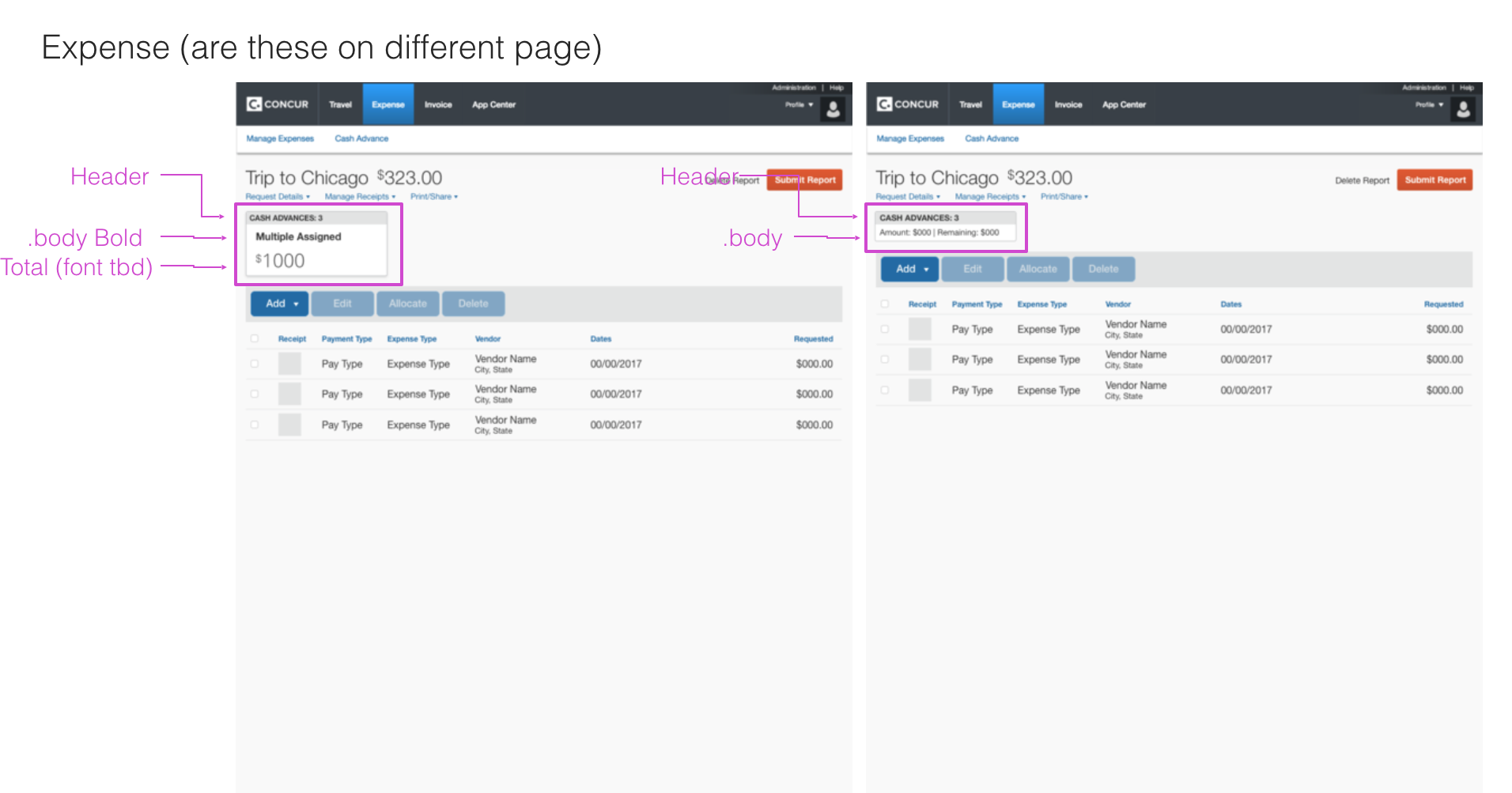
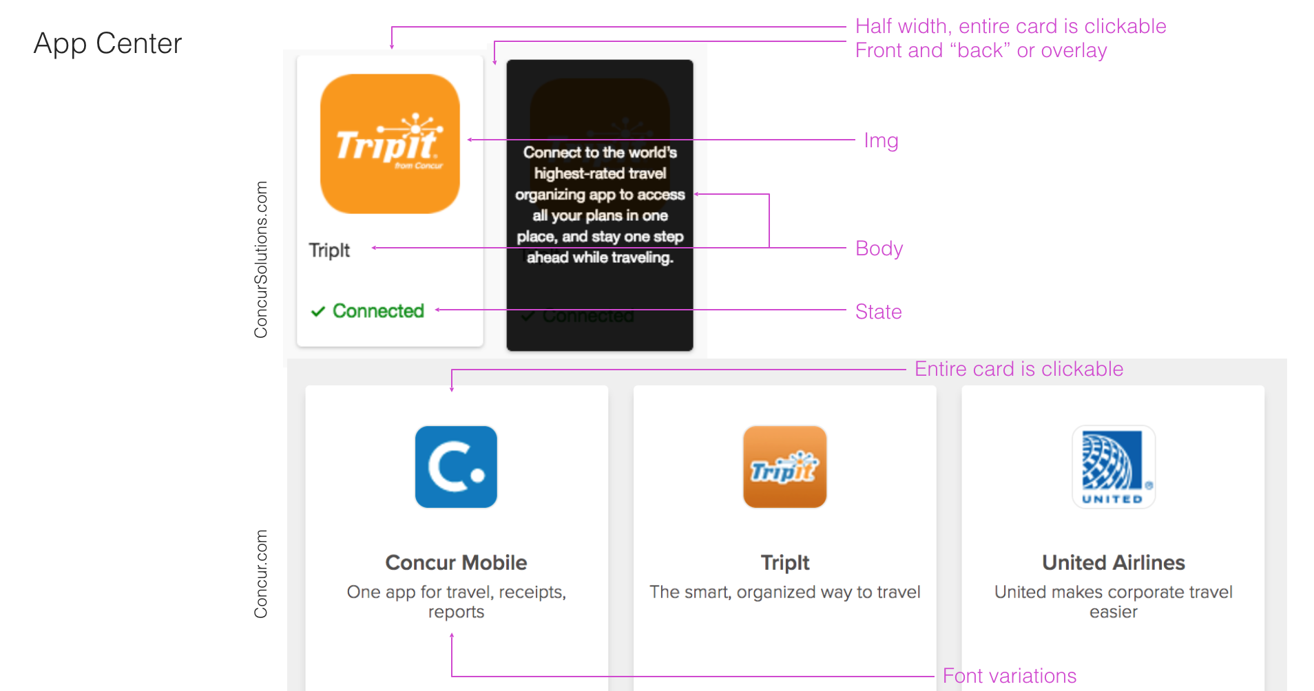
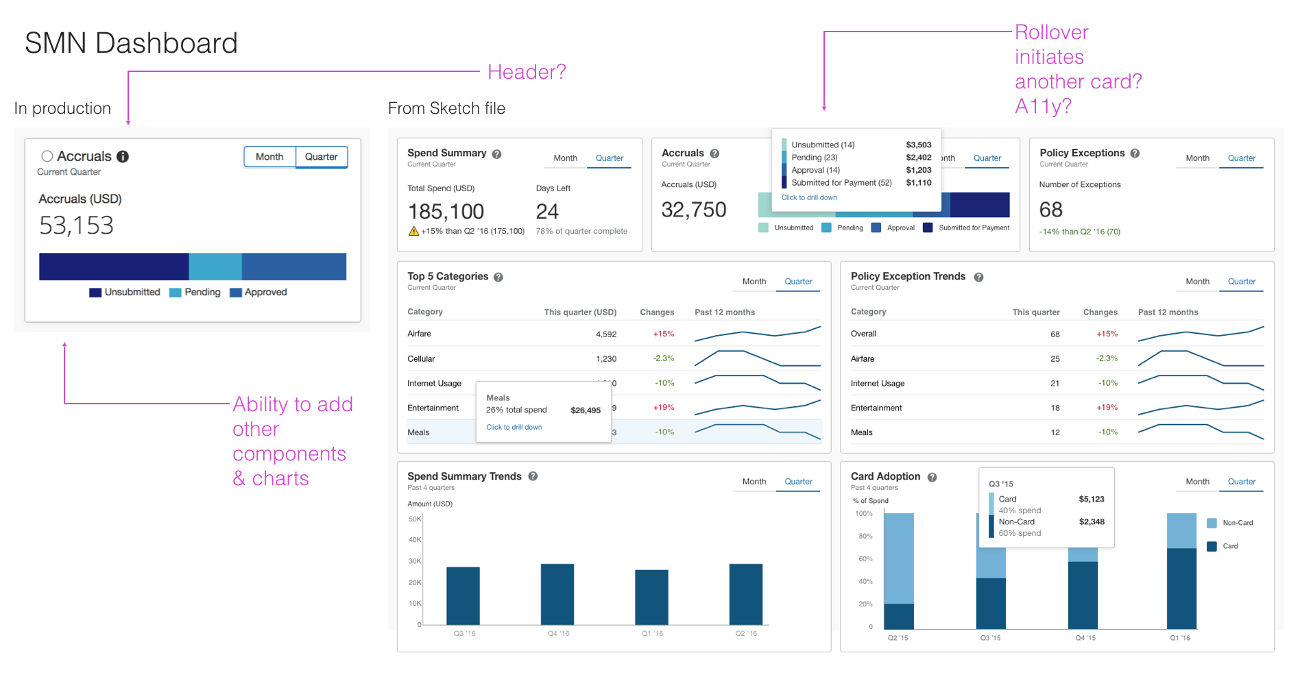
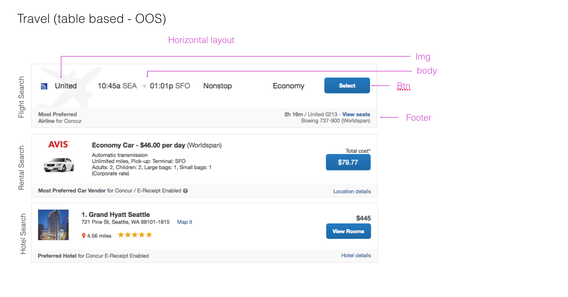
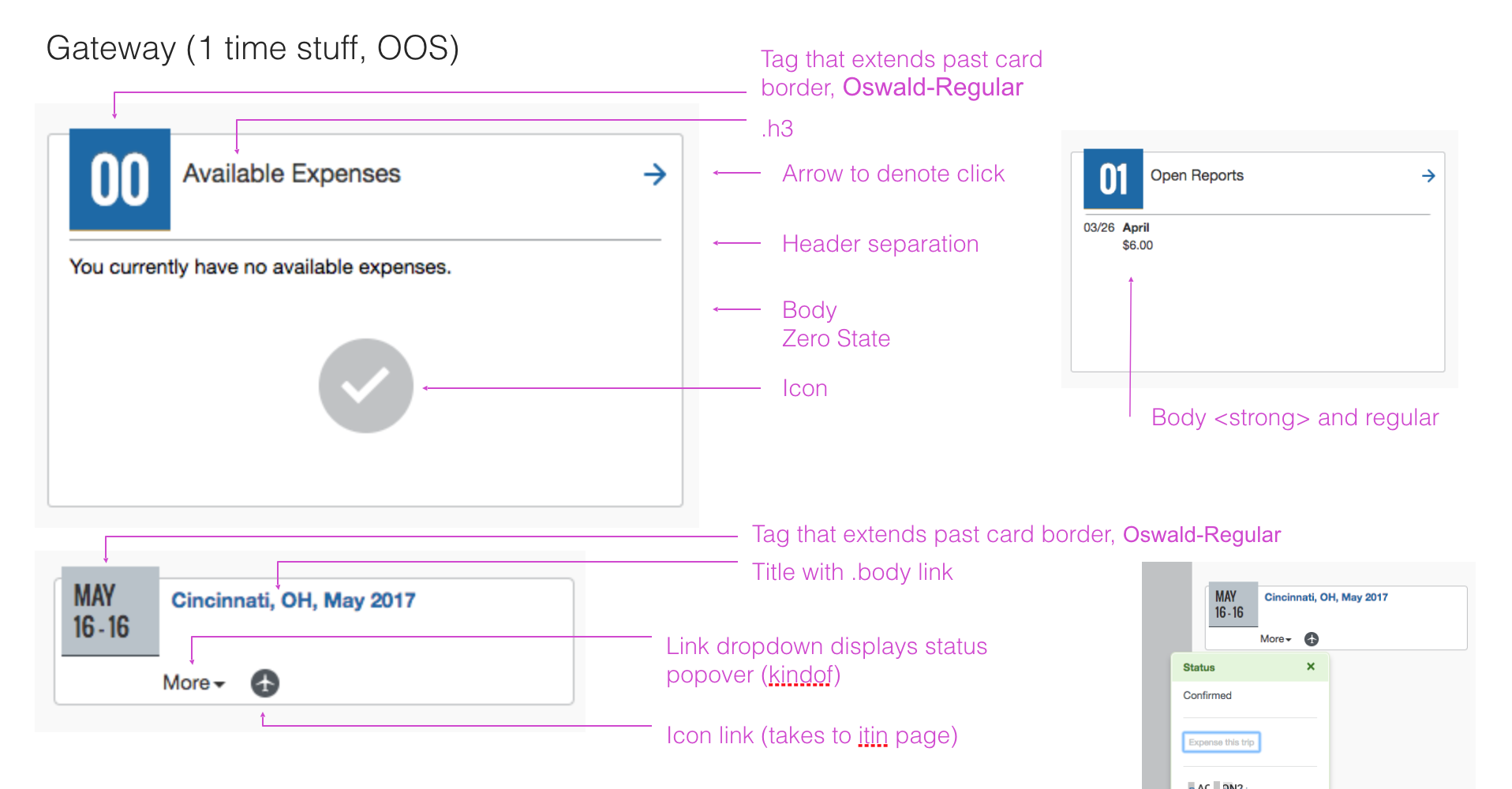
First, I took an audit of all instances of cards the products, looking for variations and noting similarities & differences in styling.
I also looked at other design systems to see how they handled similar components. I noticed that some companies called this component a card, while others called it a tile like we originally did. To alleviate confusion, I needed to clearly define what we would call this thing going forward.
After a quick brainstorm with my development team, we decided that a clear separation between the definitions of cards and tiles would enable the design system to scale as product features were added. The component we had been calling tiles actually better reflected that of a card. We defined a card as:
"Customizable content containers that group related information (e.g. expense reports, invoices, apps, etc.) in a flexible-sized container visually resembling a playing card."
In addition to a formal definition, I wrote design tenets to help understand the difference between a card and tile:
Cards:
Are containers used to organize chunks of similar content.
Are best suited for cases when users browse for information.
Cards must be self contained.
Exist as a collection.
Can be actionable or not.
If actionable, cards can contain an actionable element or be clickable itself, but can not have both.
Must be contained within a CardDeck.
Tiles:
Are containers used to organize items that may not have similar content.
Can contain additional containers.
Are triggers to lead the user to another screen with additional information.
Can exist as a one-off instance.
Can vary in size.
Scoping the project
Outlining requirements
Based on my research, I then determined acceptance criteria for the card component that I'd be moving forward with first:
Must haves:
Consistency across the Concur Platform
The ability to include additional content or components (ie: buttons, graphs / charts, etc)
Support for variable height (within same collection, same height)
Support for variable width (within same collection, same width)
Support for headers and footers
Support for states (focus, hover, disabled, zero, status)
Support for actions (trash, zoom)
The same border radius
Support for images and/or icons
Utilize Concur's existing color palette
Drop shadow property
Accessibility
Localization & Globalization
Should have:
A background default
A border default
Guidelines on usage
A heading (can be visible to screen readers only)
Could have / Nice-to-have:
Ability to rearrange
Support for animations (P1: expanding or P2: flipping) – Need to spec animation (pattern on HIG?) – issues with redux and react.
Won't have:
Sub-sections within a card
Drag & Drop support
Border color variations
Support for drop shadow variations
Determining scope
I decided to take a phased approach this project, first focusing on the most-commonly-used card to start, then working on "create new" and "drag & drop" variations of it. This scope allowed me to focus on the simplest card first, ensuring the foundation was set before moving on to more complexity. It also allowed the organization to get used to the name change (from tile to card) before too many other components were developed.
Measuring success
Finally, I defined how we would measure success once the new component was developed:
Objective success metrics:
There is a clear definition of a card and a tile (if 2 different components needed).
There are standards and recommendations for this component.
Designers and developers understand when and how to use this component.
Subjective success metrics:
Cards throughout Concur become consistent over time.
The process
Phase 1: Card & CardDeck
Design & spec
Creating the basic card and card deck was an exercise in consistency, since cards existed in the UI already. Thanks to my audit, I was able to jump right into Sketch, defining a clickable and non-clickable version that would work on white and light grey backgrounds already present in the application.
Both variations had status (header) and footer variables available, giving the design and development teams the ability to adjust the default card without using custom CSS. This would allow me to make global changes in the future without impacting the organization's productivity.
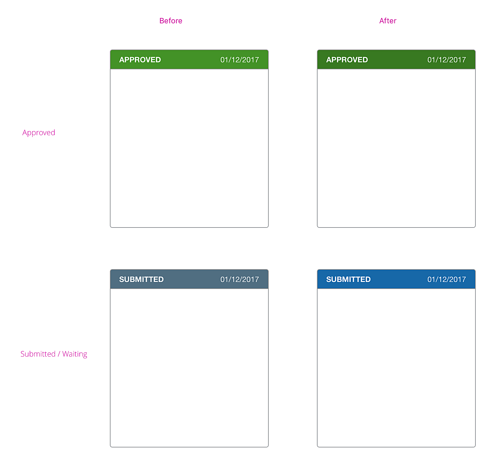
In order to meet WCAG 2.0 color contrast guidelines, I had to adjust the global status colors slightly to allow for the white text in the status (header) area. Because this change was made at a global level, color contrast immediately improved site wide.
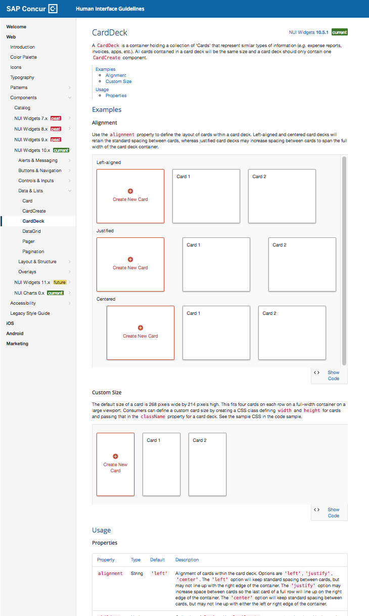
Before handing off to the development team, my last task was to spec the component. I collaborated with my development counterparts to define default aria-labels and focus states to ensure basic accessibility was included in the container itself. At this point, I also defined specs for the card deck, a container which held all of the cards, allowing them to wrap as needed.
Document
Finally, I wrote documentation for designers and developers to reference as they were creating new features. The Human Interface Guidelines (HIG) documentation site was written in Jekyll, so I was able to commit markdown changes myself without utilizing valuable development resources.
I also created a library in Sketch to streamline designer's workflow by allowing them to simply drag components (symbols) into their design and change their appearance using styles that match variables in the HIG, including hover and focus states. The library was broken down in accordance to Atomic Design principles, starting with atoms – typography, colors, icons, and combining these to create molecules by which the other designers could begin to create pages. I knew SAP Concur products needed to be adaptive to meet WCAG 2.0 guidelines, so I made sure to create this library with that in mind, creating symbols which worked at any breakpoint.
Phase 2: CardCreate & Upload
Refining the problem
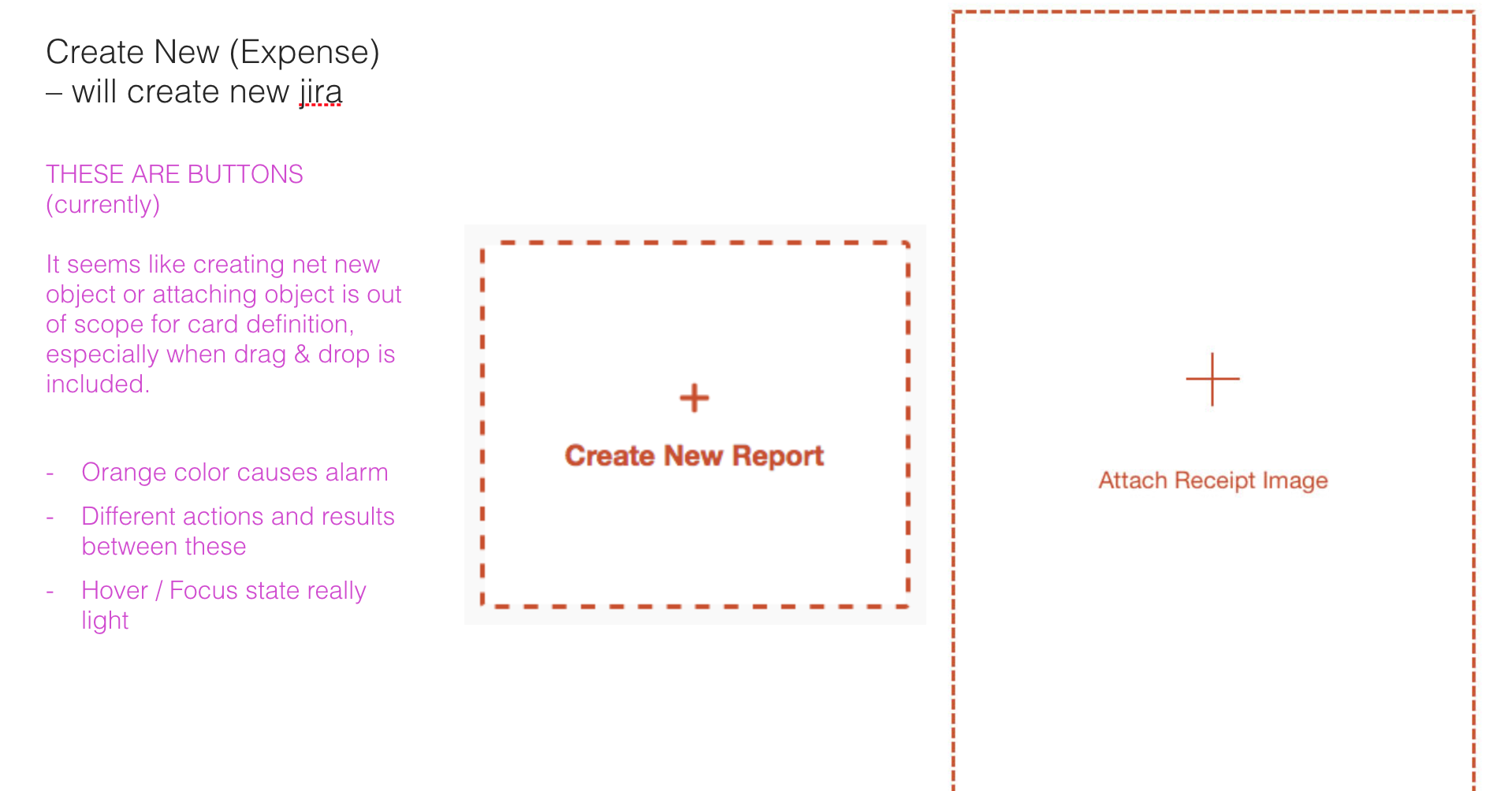
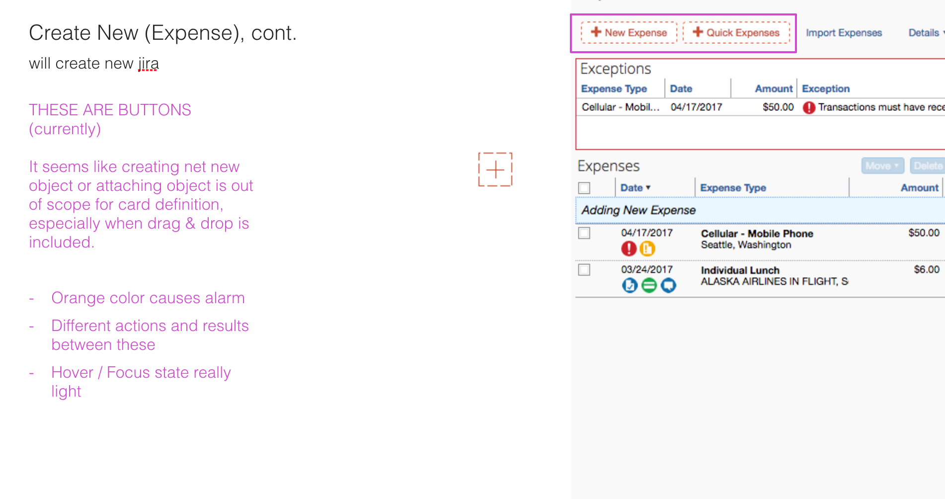
CardCreate was clicked when a user wanted to create a new instance of an element within the application (i.e. a new expense report). We had gotten feedback for years that the original orange color used to denote this type of card caused alarm, as users thought it was a warning upon first glance. Unfortunately, this style had been adopted for a variety of buttons as well, so the updates made needed to apply to those too.
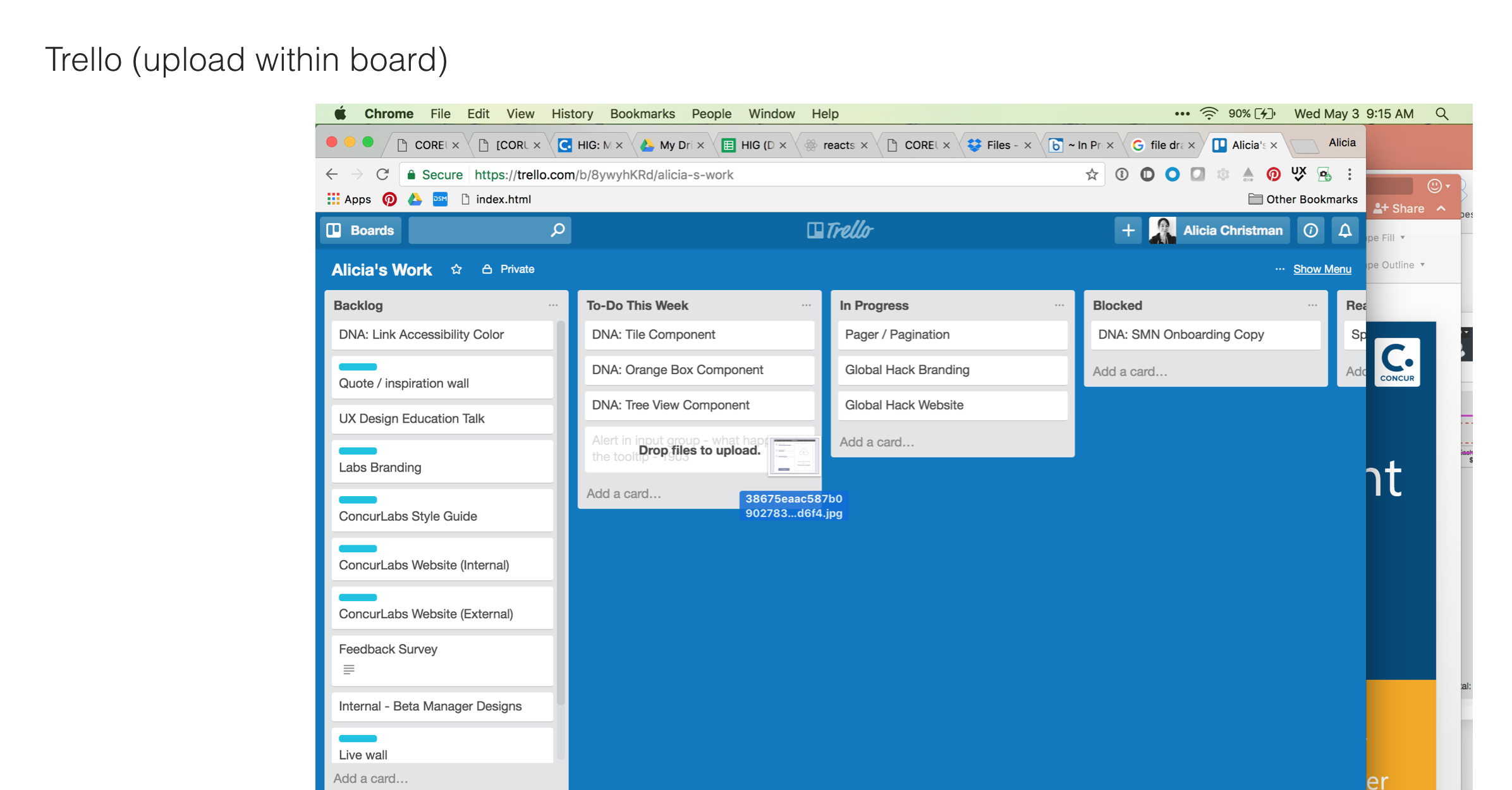
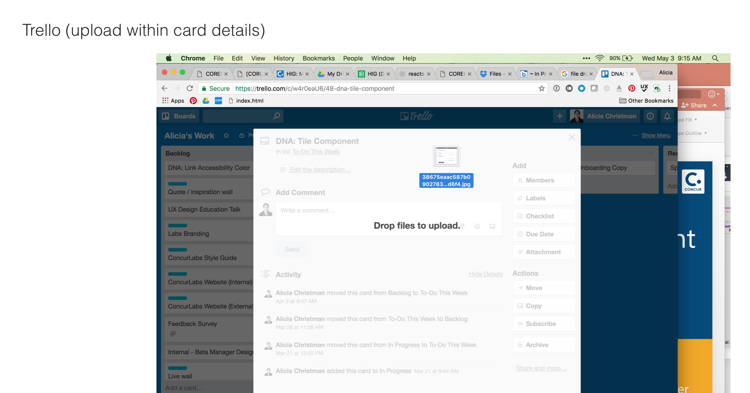
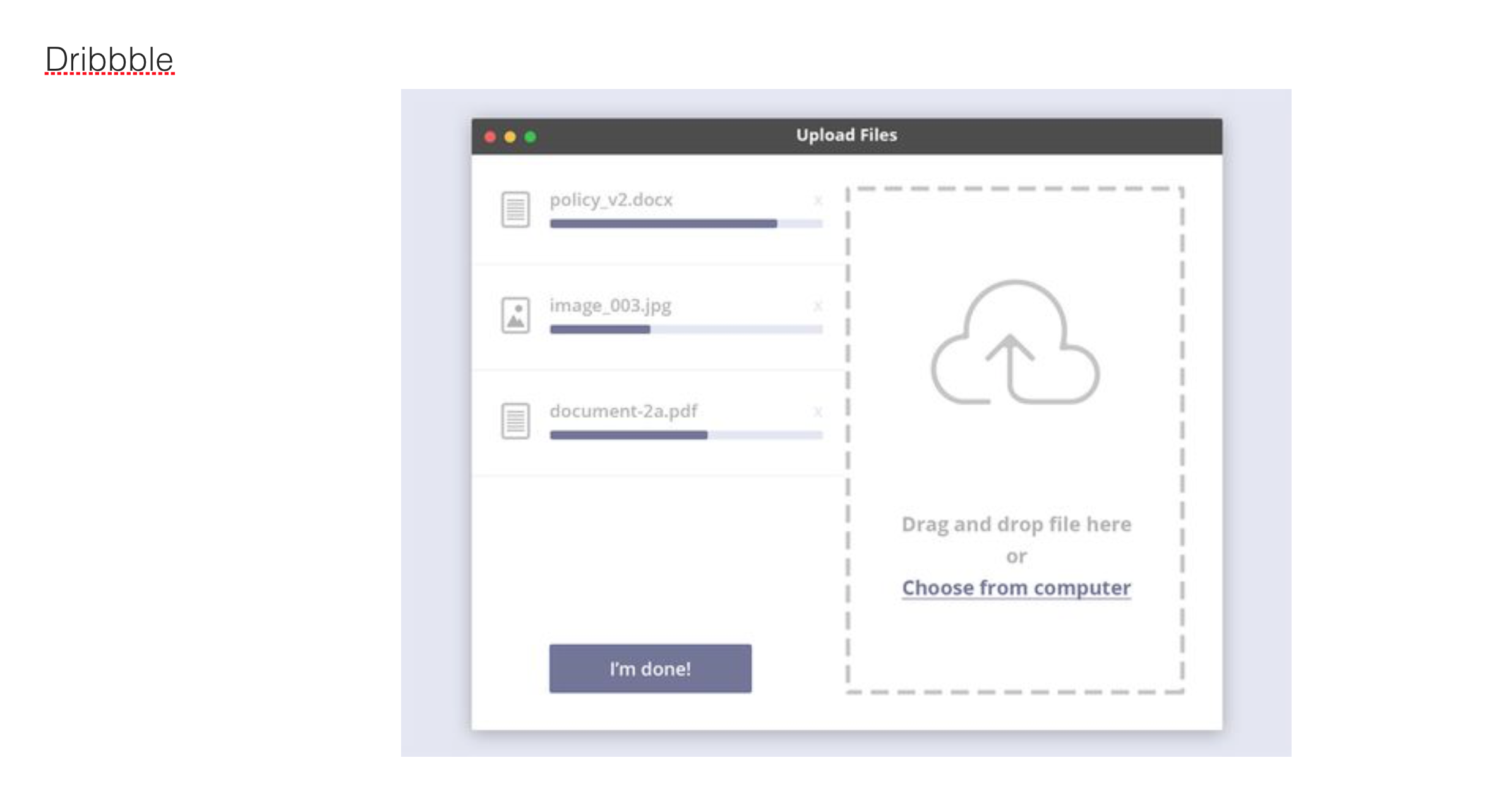
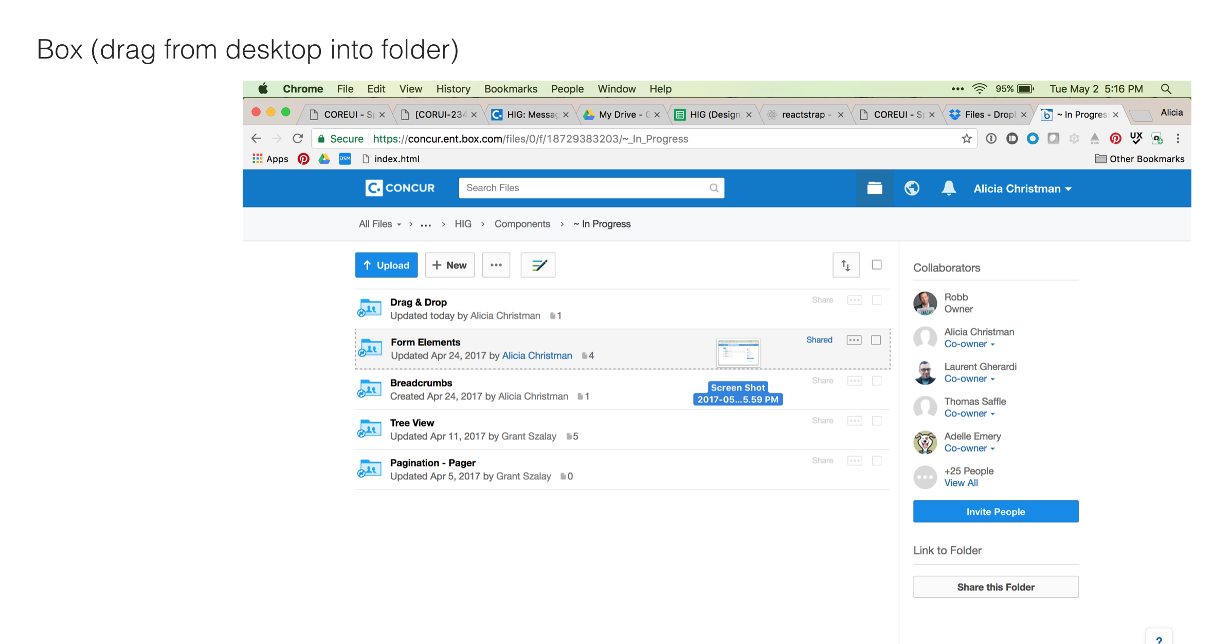
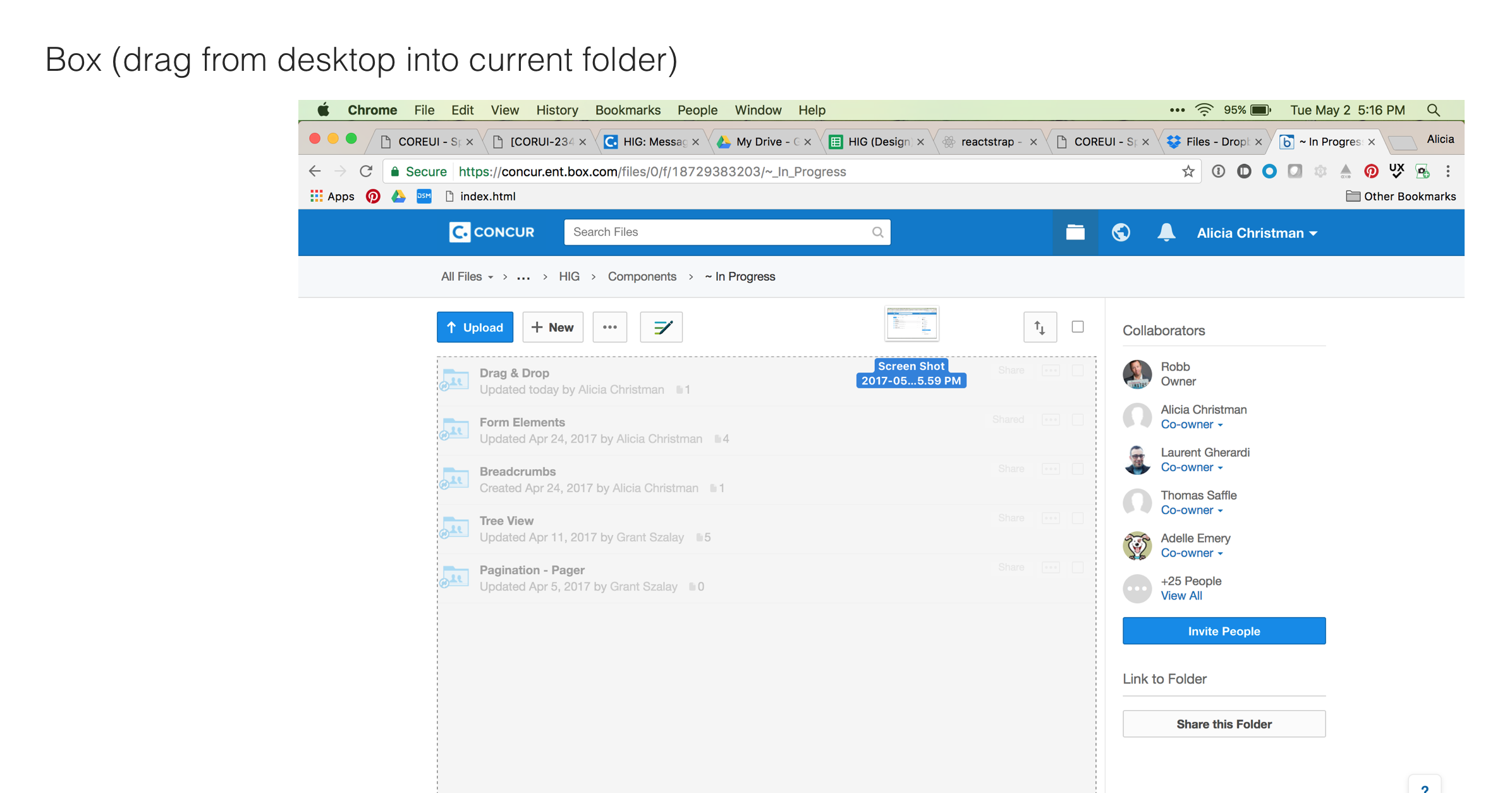
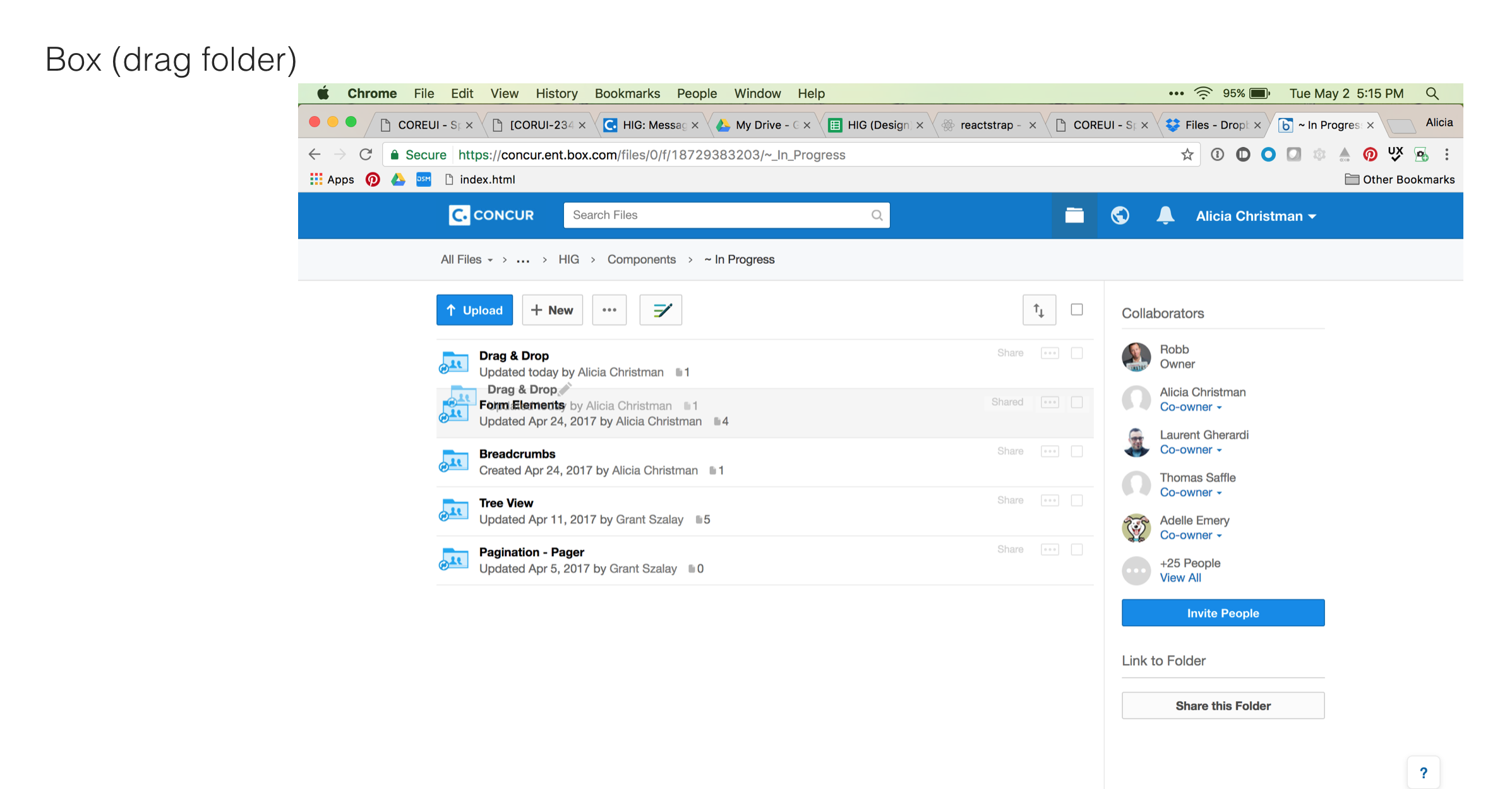
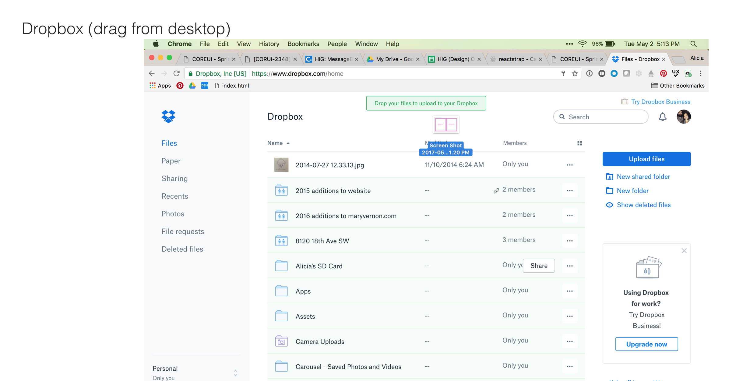
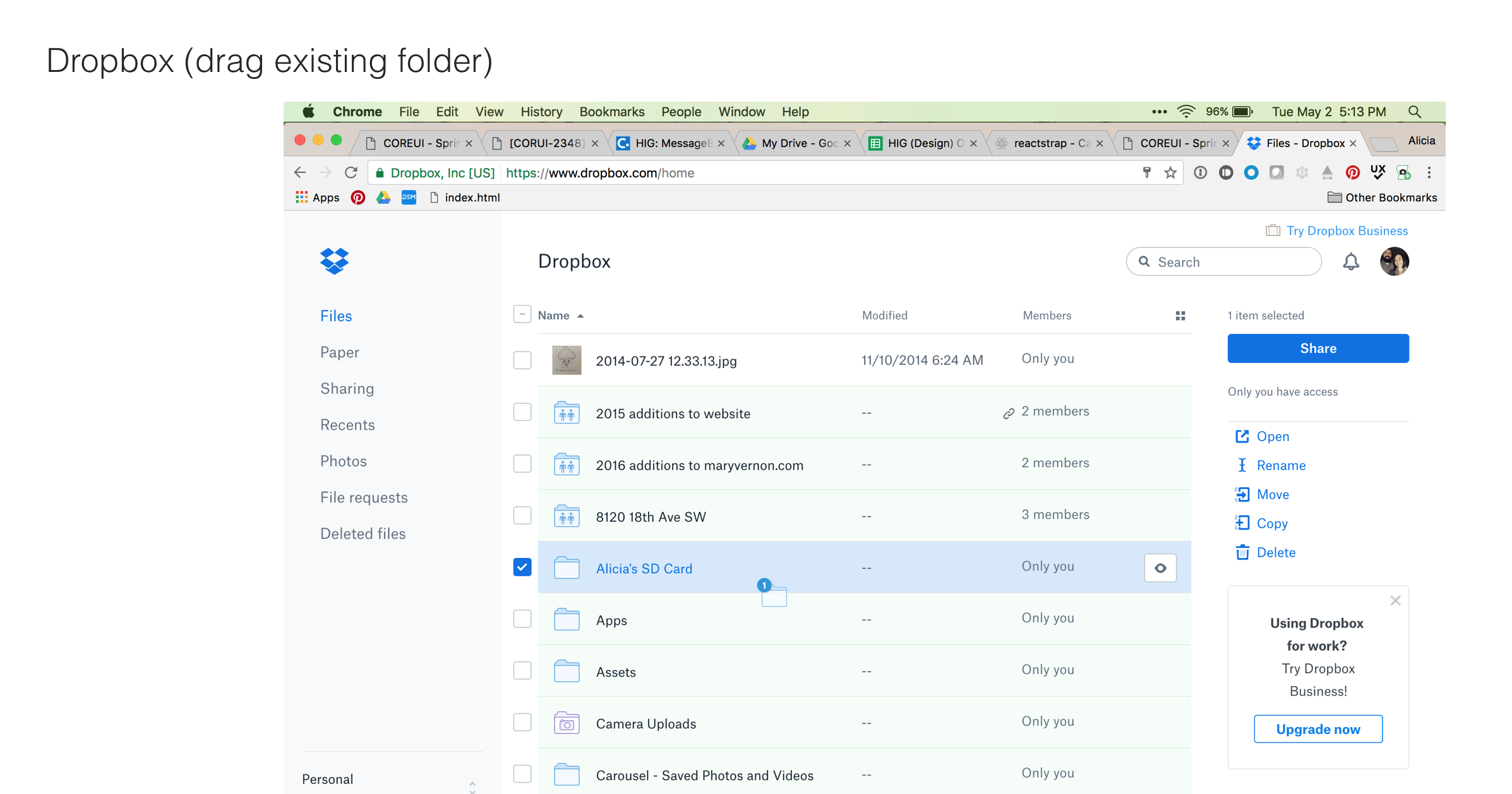
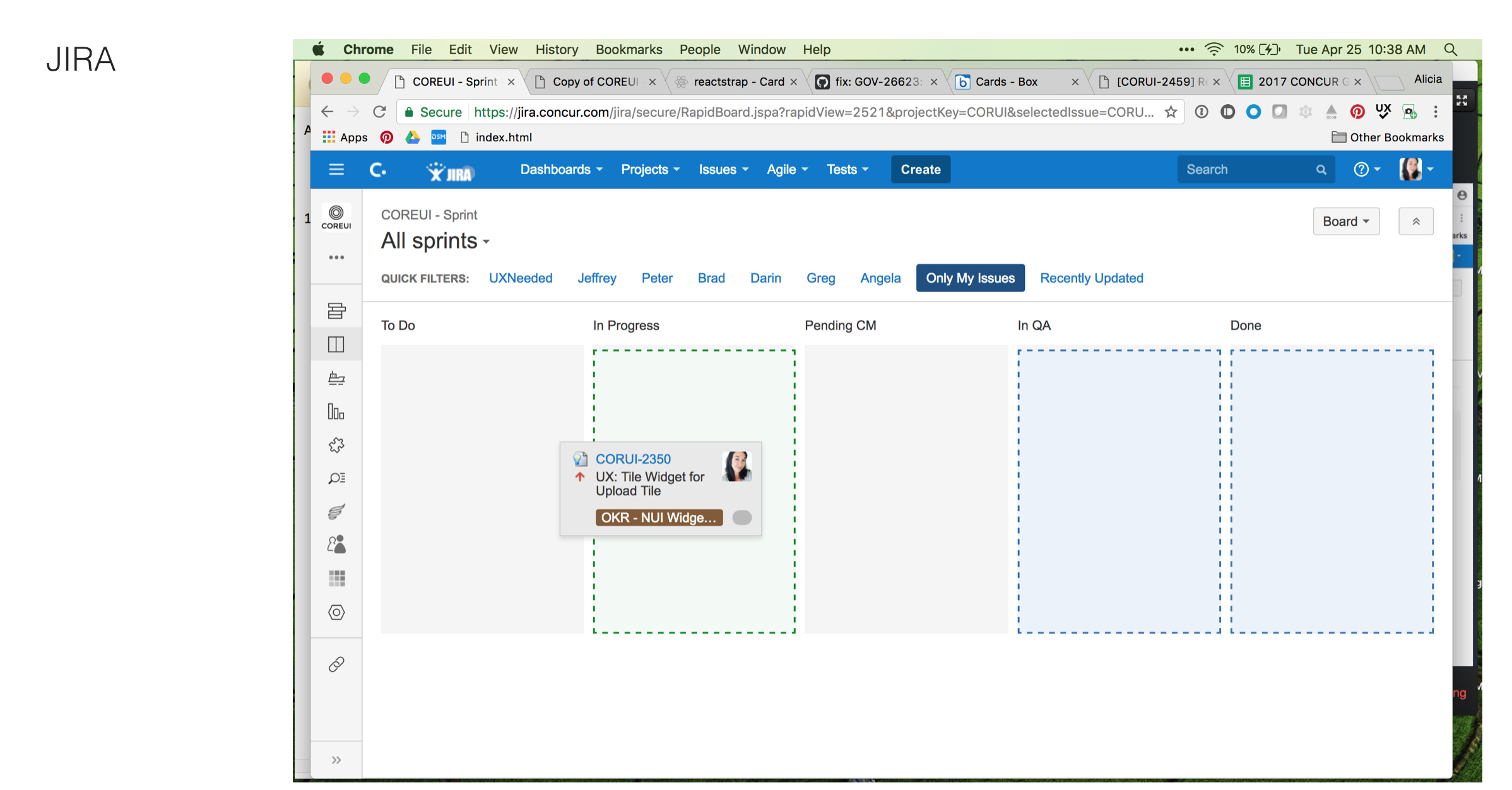
Additionally, the card had drag & drop upload functionality already, but there was no signifier that this functionality existed. I needed to make it apparent that users could drag files to that space, so they could expedite their workflow.
Since the color change was relatively straight-forward, I'll take you through the Upload component creation.
Getting inspiration
Again, I did a ton of research about drag & drop functionality elsewhere to understand signifiers that users would have encountered already.
Defining requirements
Similarly to my process with the Card and CardDeck components, I refined requirements and tenets to guide the design.
Must Have:
Consistency across the Concur Platform
Support for small, medium, and large component types
Support for states (focus, hover)
Be a component that can live outside of a card
Drag & Drop support
Browse functionality
A11y
Localization
Error handling
Should Have:
Guidelines on usage
Won't Have:
Ability to rearrange
Support for animations (P1: expanding or P2: flipping) – Need to spec animation (pattern on HIG?) – issues with redux and react
Writing design tenets
Because this was a net-new component, I needed to get consensus around some basic tenets in order to control scope and ease decision making down the road:
If drag & drop functionality is available, we will make it obvious to the user.
We will only provide drag & drop functionality where it makes sense and is easy to use.
We will give users another way to upload files, in addition to drag & drop.
Plan
It became evident almost immediately, due to database configurations across products, I needed to diagram how the component would behave once an upload was initiated. I determined there needed to be a simple and complex version of the component:
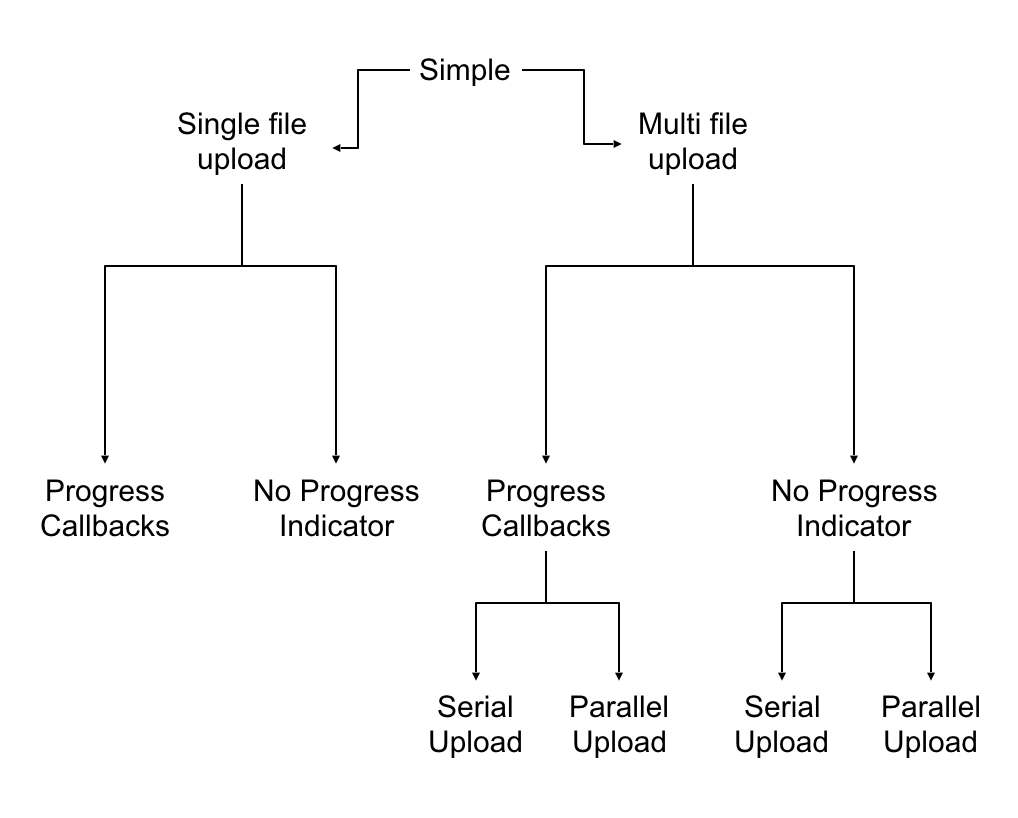
The simple variant gave users high-level feedback that their upload was in progress regardless of if a single or multiple files were uploaded.
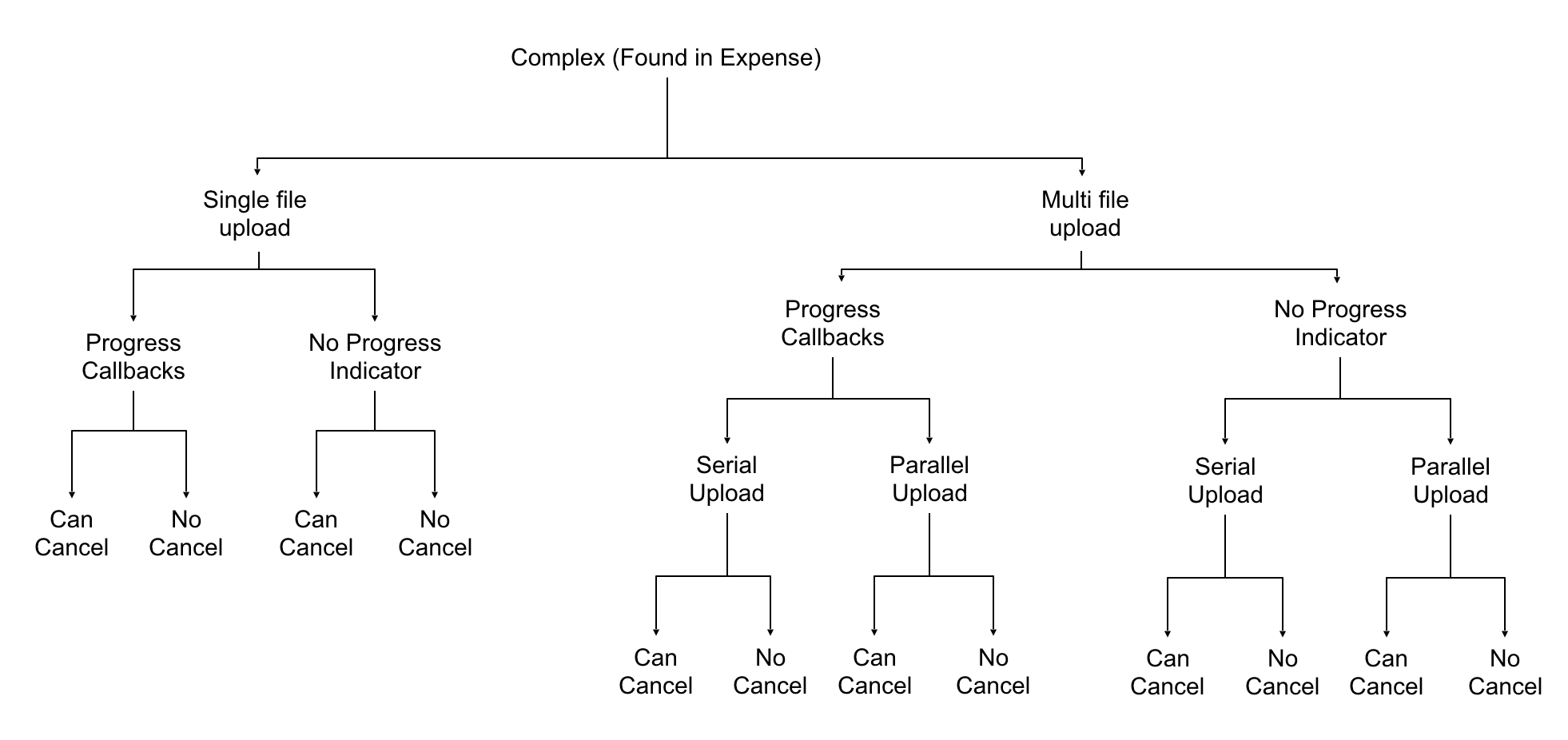
The complex variant gave users feedback on the progress of each file and allowed them to cancel each upload if necessary.
Design
I started the design phase by exploring different ways to convey that the drag and drop functionality was available, as well as the progress of the upload once started. I collaborated with both my design & development teams daily to ensure the components met their needs, incorporated feedback, and finally landed on a flow that signaled drag and drop functionality to the user.
I also outlined a ton of variations for the upload progress indicator itself.
Spec
Finally, it was time to spec the design for the development team. In addition to defining spacing of the components themselves, I outlined how the upload container and upload status components could be configured by default, giving teams a few options to allow for flexibility in design.
The outcome
Thanks to the research I had done (and some gentle reminding), the shift from Tiles to Cards organization wide happened relatively quickly. I supported my development team as they rapidly implemented the Card & CardDeck components for global use. Designers and developers started using the Card & CardDeck components immediately, identifying additional functionality they'd like to see built for future iterations.
The CardCreate component design process identified a huge need to re-think Concur's color palette to maintain a colorful UI, while getting rid of the shocking orange color. Initial changes to the component's design were minimal, but led to the prioritization of the color palette work across mobile and desktop UX teams as I was leaving. Unfortunately I left this role before the Upload component was built so I was unable to write documentation for this component, but this would have been the next step.
